

Each year, like many other paint brands, Sherwin-Williams issues their forecast predicting the colors they think will dominate the interior design world in the year to follow.
The Sherwin-Williams Colormix® Forecast for 2025 offers a diverse palette that can be seamlessly integrated into vintage home decor. The four color capsules are Chrysalis, Paradox, Wellspring, and Kindred. Below, I explore how these colors can enhance and redefine spaces with a vintage aesthetic.

SUBSCRIBE
AND GET THE FREE NEWSLETTER


The Chrysalis capsule, characterized by grounded earthy tones, is ideal for creating spaces that radiate warmth and stability.
This collection’s muted clay, mauve, and gray shades are particularly well-suited for vintage settings. The colors included in the Chrysalis capsule can beautifully correspond with dark wood vintage furniture.
Minimalist vintage rooms (think Scandi vintage or modest Victorian interiors) would look great in this palette.
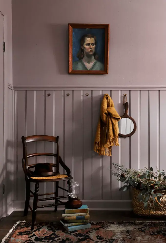
Vertical beadboard looks gorgeous in Studio Mauve, one of this capsule’s colors, paired with a vintage chair, rug, and artwork in the photo below:
Source: Hackrea
Thunderous-painted cabinetry in the kitchen, paired with retro appliances, can create a cohesive and nostalgic look:

Source: Pennies For A Fortune
Some of the shades make me think of the early American colors, making them a good fit for a vintage American farmhouse.
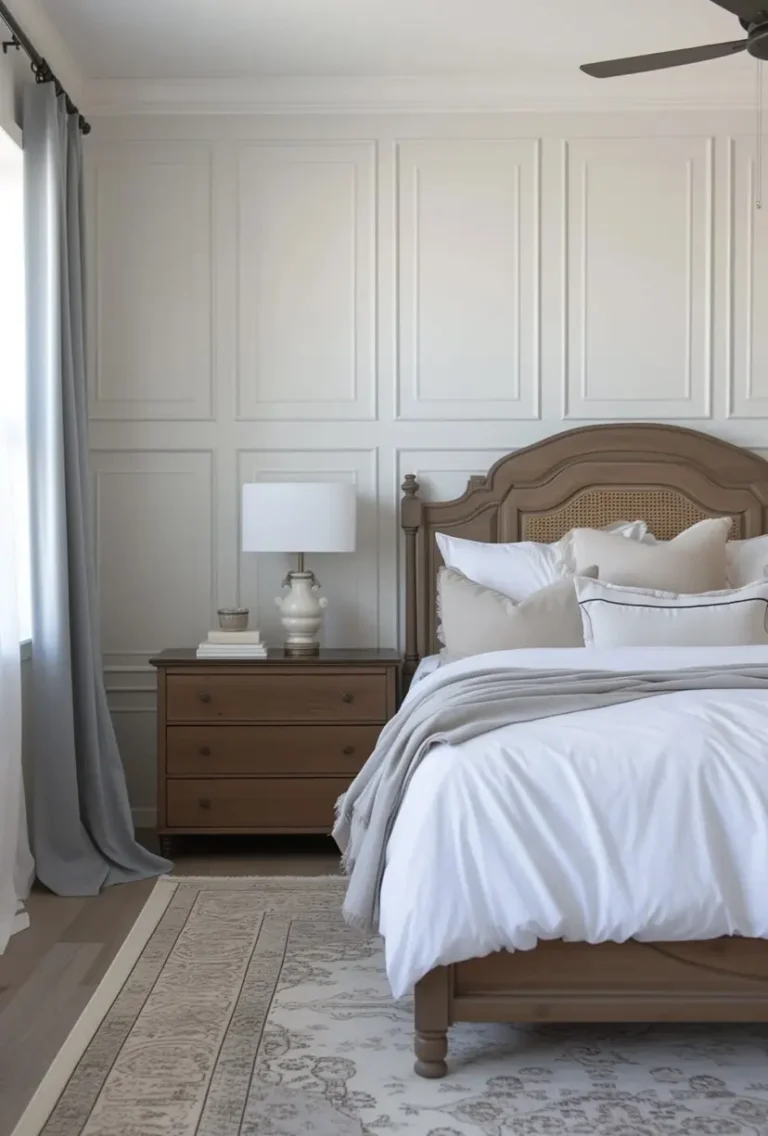
Speaking of which, Drift of Mist makes a beautiful trim option in this modern vintage farmhouse bedroom:
Source: Jenna Kate At Home

Wellspring is a collection that screams vintage with its warm-toned neutrals and deep greens. These bold colors are perfect for rooms where a warm, inviting atmosphere is key, echoing the decor styles of the 1950s and 1960s.
Source: Sherwin-Williams
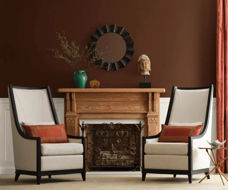
A French Roast accent wall in a living room can serve as a beautiful backdrop for mid-century modern furniture.
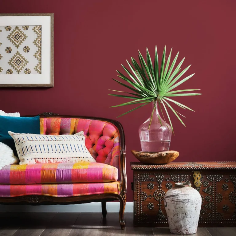
The capsule also includes a beautiful paint color called Borscht, which can perfectly complement an antique-style sofa upholstered in lively colors:
Source: Sherwin-Williams (Facebook)
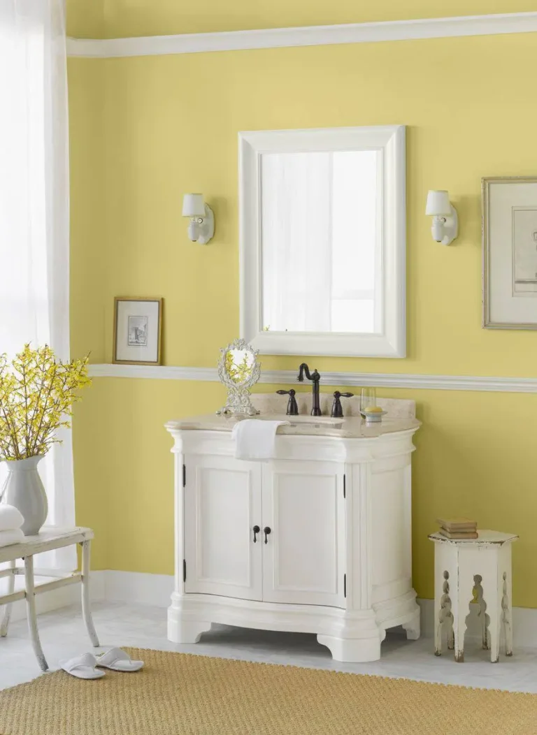
Another color that stood out to me in this palette is Chartreuse, which can bring so much liveliness to an overwhelmingly antique-filled room. With the walls painted this color, you can have all the dark wood furniture you want.
Chartreuse is a great color for a 1950s interior too.
It would also work wonders in a vintage-inspired bathroom, paired with white furniture, creating an unexpected color combo:
And Upward is a great color for Grandmillennial-style interiors:
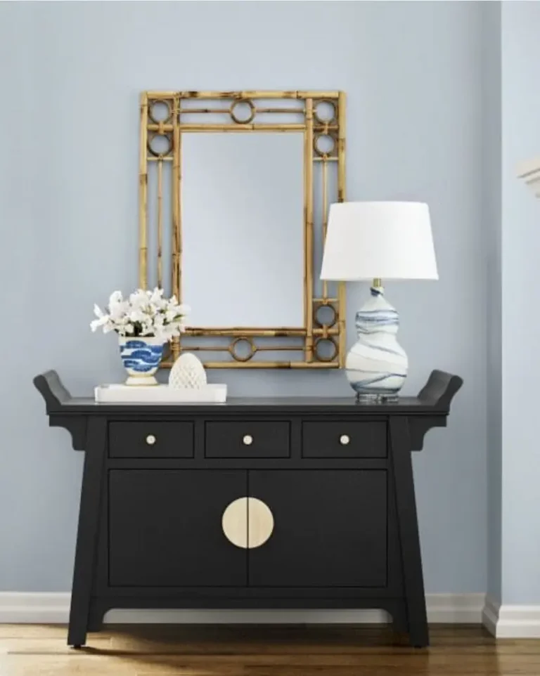
Source: @pelicanpainting_chs (Instagram)

The Paradox capsule is fun and carries a tropical twist to it if you ask me. The rich and spunky colors can enhance the grandeur of traditional vintage decor.
These are the colors you want to paint your accent wall and statement furniture piece if you’re into the color-drenching trend.
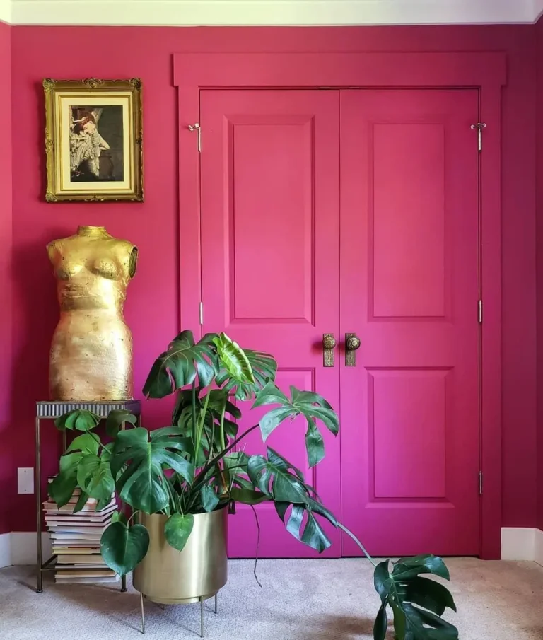
Source: Sherwin-Williams (Facebook)
You can try Dragon Fruit, Talipot Palm, Frank Blue, or Rejuvenate on your vintage:
Frank Blue dominating a butler’s pantry designed by Archer & Buchanan:
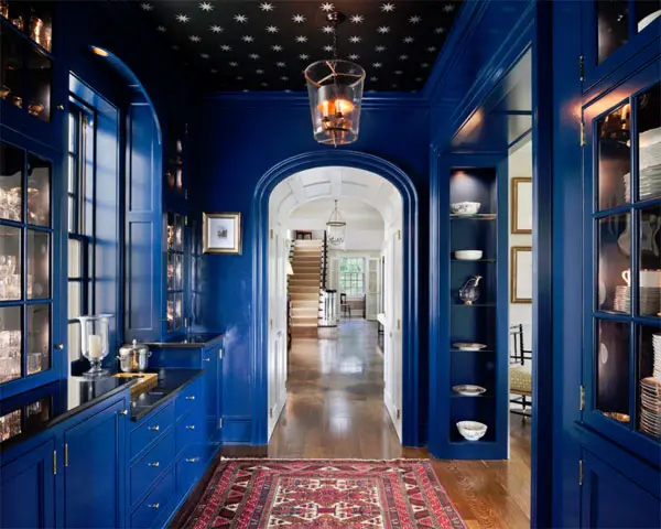
Source: Lisa Mende Design
Another color I really like in this set and find a great option for vintage homes is Antiquarian Brown. It looks absolutely stunning on a vintage-style door:

Antiquarian Brown is the color to paint your focal point without being too excessive.
And Cascades makes a dazzling exterior paint for a Victorian home…
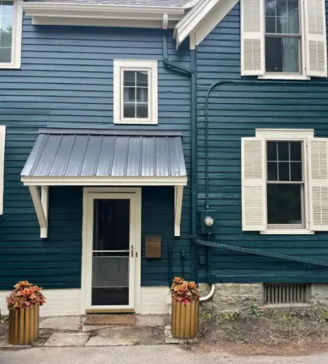
Source: Mood And Mood
…And is also a breathtaking option in a vintage-inspired interior, coupled with an orange-brown wall:
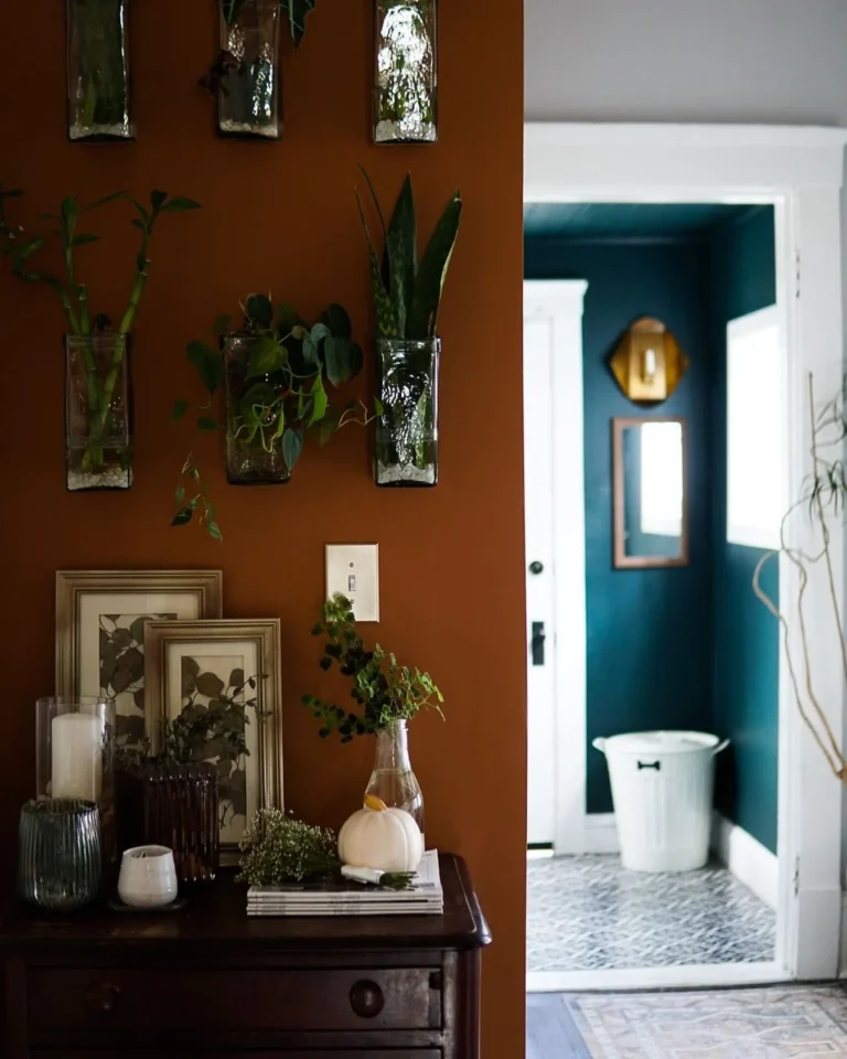
Source: @thenewlywedwards (Instagram)

Now, Kindred offers a playful mix of pastels and bright tones, perfect for bringing a light-hearted vibe to vintage decor.
Being a late-Victorian fanatic, I find this capsule to be the most appealing due to its bright, yet subdued tones. I think it’s the most late Victorian-friendly palette from this selection.
As soon as I started inspecting the colors, the first one to grab my attention was Redend Point, and I couldn’t help but notice its close ties to the famous Victorian color – Ashes of Roses.
The ceiling and fireplace mantel, both painted Redend Point, blend in perfectly well with the citrus-botanical William Morris wallpaper and antique-style furniture in the photo below:
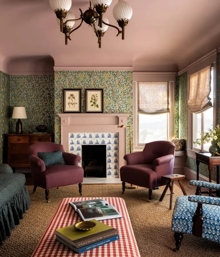
Source: Photo by Haris Kenjar via The Nordroom
The low-key blush pink of Redend Point looks the part with some blue and white Delft tiles:
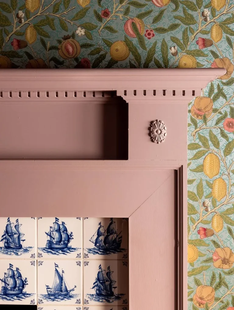
Source: Photo by Haris Kenjar via The Nordroom
I see this color along with Creamy paired with classic wooden toys and heirloom furniture in a vintage-inspired nursery or children’s room.
Another one that stood out to me was Rookwood Red and this Victorian door is proof that it will do well in vintage decor:
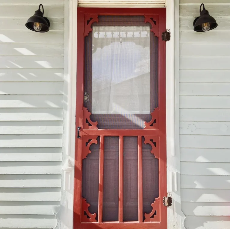
Source: @rethavictorian (Instagram)
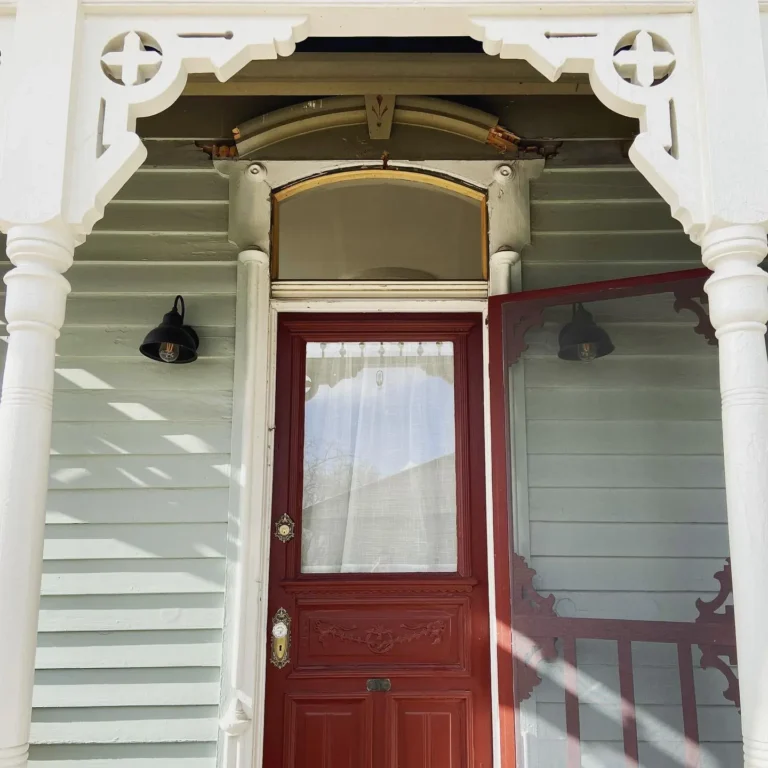
Source: @rethavictorian (Instagram)
Now from the opposite side of the spectrum – the way Tidewater from the Kindred capsule makes the black hardware stand out on this vintage door is sooo amazing:
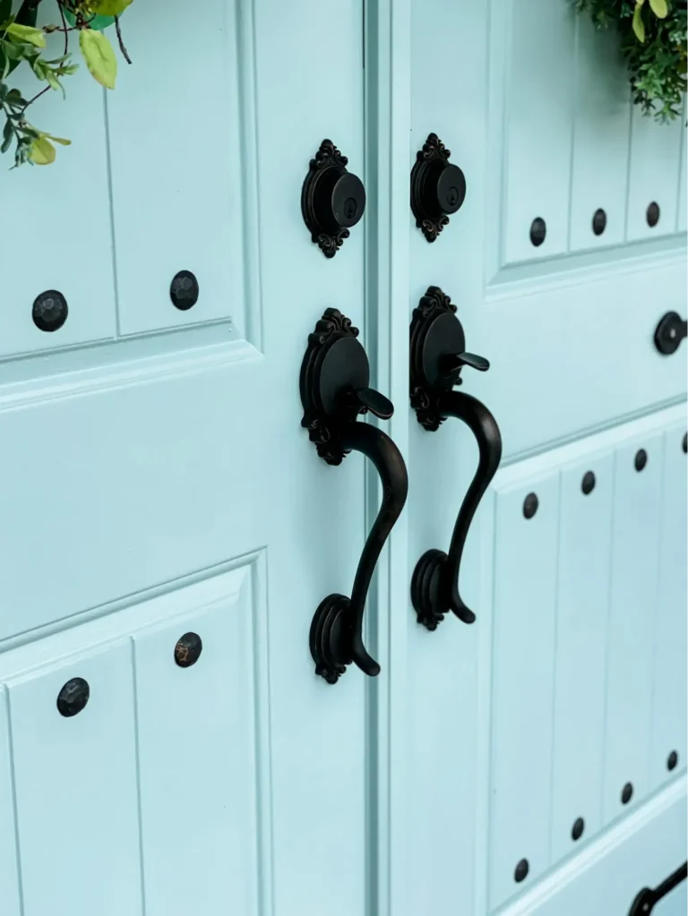
Source: Re-Fabbed
It corresponds so gracefully with yellow elements:
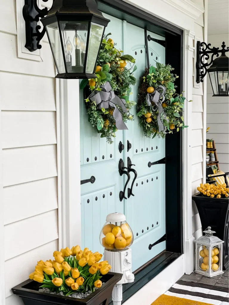
Source: Re-Fabbed
The 2025 Sherwin-Williams color capsules—Chrysalis, Paradox, Wellspring, and Kindred—provide lots of opportunities to enhance and refresh vintage interiors and exteriors. I am happy to see that so many of these colors can be incorporated into and work well with vintage furniture, especially my beloved late-Victorian design.
